Client Overview
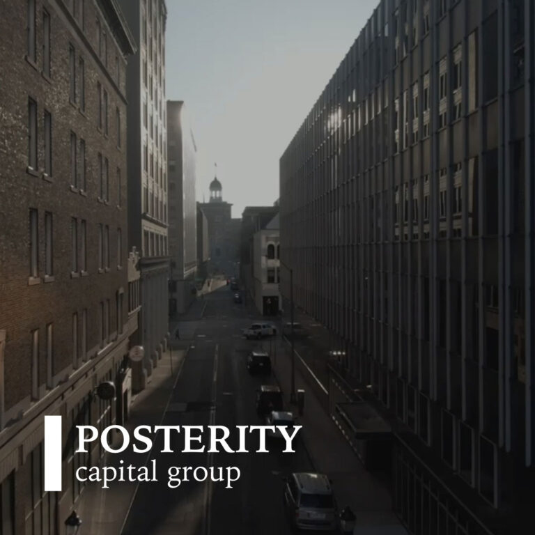
Posterity Capital Group is a 100% black-owned and managed South African property investment and asset management company. Their mission is to transform underperforming properties into thriving student, residential, and retail spaces that enrich communities while delivering sustainable returns. As their business and brand evolved, Posterity realised that their old website no longer reflected who they were or where they were heading. The site’s corporate look and outdated design created a disconnect between the company’s modern, community-focused ethos and its online presence.
The Challenge
Posterity’s previous site failed to communicate the vibrancy and credibility of their brand. It was difficult to navigate, lacked mobile responsiveness, and couldn’t scale with their expanding business portfolio. They wanted a design that felt contemporary, approachable, and aligned with their mission to transform properties and enrich communities. Revitalising the Posterity Investment Group’s online presence
The Solution
Digitlab reimagined Posterity’s digital presence with a complete website redesign built on WordPress and Elementor. The new site combines modern design with practical functionality, empowering Posterity’s team to manage and update content independently. We introduced a clean, mobile-first layout, authentic imagery, and a structured navigation system to guide users effortlessly through their offerings.
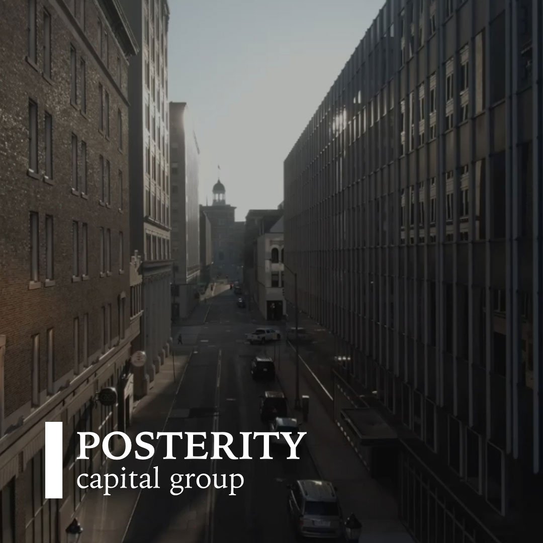
Logo Design
The Posterity Capital Group logo is built on simplicity and strength — a refined blend of modern minimalism and traditional professionalism.
The vertical lime bar represents growth, stability, and a forward-looking vision.
The bold serif typography communicates trust, heritage, and financial integrity.
The contrast of white and lime green reflects clarity, confidence, and innovation.
Together, these elements form a timeless and professional mark that embodies Posterity’s commitment to sustainable progress and lasting value.
Website Design Direction
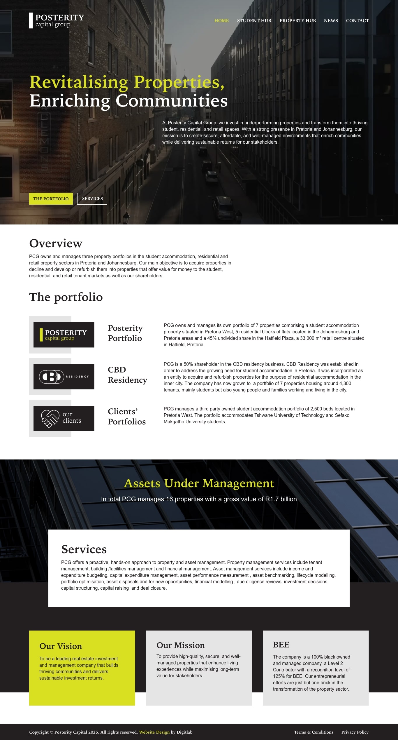
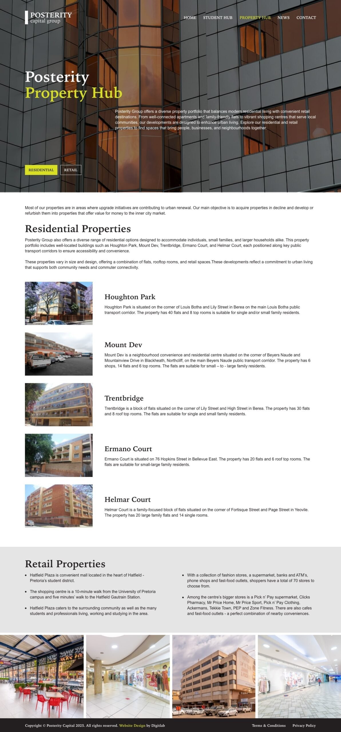
The design direction for Posterity Capital Group’s new website was rooted in creating a visually modern, credible and dynamic platform that aligns with the company’s mission of “Revitalising Properties, Enriching Communities”.
Key elements of the design approach include:
- Authentic imagery & real-world context: The site uses large hero visuals of properties and communities to ground the brand in actual transformations, rather than abstract corporate stock.
- Clean, modern typography and white space: A restrained typographic hierarchy and generous white space help present complex property data and portfolio information in a clear, accessible way.
- Structured navigation for diverse audiences: The menu and hub sections prioritise the company’s three core portfolios (student-, residential-, retail-) and reflect the different stakeholder journeys: tenants, investors, partners.
- Mobile-first and responsive experience: Recognising that many users will browse on smartphones (students, campus leads, investors on the move), the layout is optimised for mobile devices without sacrificing visual impact on desktop.
- Modular page templates & WordPress-Elementor flexibility: The back-end is built so Posterity’s team can easily add new portfolio entries, update pipeline information, swap imagery, and adjust content as their business evolves.
- Visual alignment with brand purpose: The colour palette, iconography and layout reflect Posterity’s dual identity as both a property investor and a community-enabler—combining professionalism (for investors) and warmth/approachability (for tenants).
The Result
The new Posterity website delivers a dynamic, engaging experience that reflects their growth and purpose. It communicates their value clearly to investors, tenants, and partners while showcasing their portfolio with confidence. Beyond aesthetics, the new site gives Posterity a powerful, scalable platform to support future expansion.
By combining thoughtful strategy, clean design, and technical flexibility, Digitlab helped Posterity move from an outdated corporate look to a bold, future-ready digital identity—one that truly represents who they are and where they’re headed.