Client Overview
Posterity Student Living is a student accommodation brand designed for more than just a place to stay. Focused on students attending TUT and surrounding institutions, particularly those from lower-income backgrounds, Posterity offers a holistic living experience that supports students academically, socially, and personally.
With programmes dedicated to wellbeing, leadership development, and community connection, Posterity creates environments where students don’t just survive university — they thrive in it.
The brand’s ethos is grounded in growth, inclusion, and support, and its mission is to be a safe, vibrant home for young people navigating the defining years of their lives.
The Challenge
Posterity Student Living wasn’t just looking for a logo refresh — they needed a brand system that could speak to students, support their student life mission, and stand out in a competitive market.
The Insight
We discovered that students want more than shelter. They’re looking for safety, community, purpose — a place to grow into who they’re becoming. Posterity already provided that. The brand just wasn’t telling that story yet.

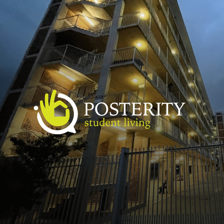
Logo Design
The new logo is layered with meaning:
The OK hand gesture = a reassuring symbol of safety
The house icon = a visual shorthand for accommodation
The speech bubble = social connection and mental wellbeing
Together, it forms a distinctive and student-friendly mark that’s both playful and trustworthy.
The Look & Feel
The Look & Feel
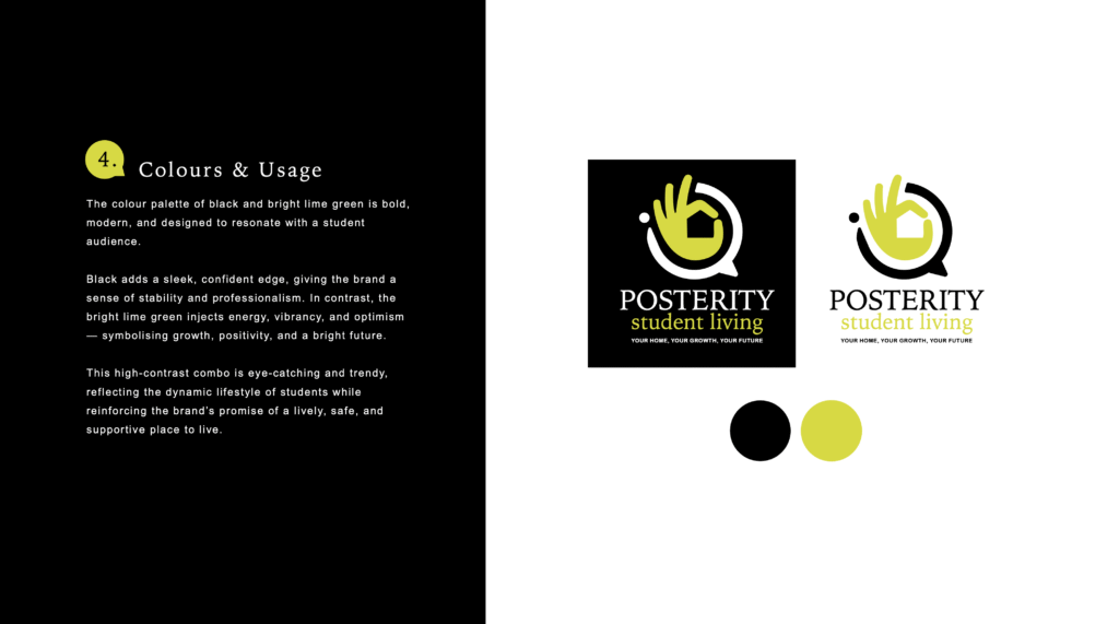
We leaned into a bold black and lime green colour palette — sleek, modern, and full of energy.
Black = confidence and professionalism
Lime green = optimism and vibrancy
This high-contrast combo jumps off screens and signage alike, instantly recognisable and full of personality.
Brand Guide
To keep Posterity’s message sharp, student-friendly, and consistent across every platform, we created a comprehensive Brand Guide — the go-to reference for how the brand should look, feel, and speak.
This guide covers:
Logo construction and spacing rules — so it always shows up clean and clear
Typography hierarchy — combining Iowan Old Style and Arial for the perfect mix of academic and accessible
Approved colour palette — with HEX codes for that bold lime-and-black combo
Tone of voice and messaging guidance — to keep the brand supportive, inclusive, and empowering
Imagery direction — showcasing real student life: friendships, learning, belonging
Whether it’s a hoodie design, a social post, or an email footer, this guide ensures every Posterity touchpoint stays on-brand and on-point — growing with students, not just alongside them.
The Result
Posterity’s new brand now matches what they’ve always been about: student-first living that’s about more than a bed — it’s about becoming.
From branded apparel to social media assets, the system is designed to build community, spark connection, and support growth — exactly what today’s students expect.