The Brief
Apex Scientific wanted to refresh their branding but weren’t sure of exactly what they were looking for. The main challenge was that their logo didn’t flex well between different necessary applications. Their first reaction was to ‘play it safe’ in order to still be recognised in the industry. However, after seeing our well-thought-out options, they realised that they were ready and excited to give their branding a more thorough, out-of-the-box rework. They were ready to stand out!
The Project
The initial project was a logo redesign which included a full brand guide, business card design, letterhead, email signatures and a social media pack. After Apex Scientific saw the breadth of what Digitlab can offer, we were commissioned to also create a logo animation and event stall artwork.
After discovering our wide range of digital solutions, the client opted for the creation of RFID business cards which we were able to facilitate. Apex Scientific was working on a tight timeline for this brand refresh, which meant we needed to deliver exceptional design work in a short space of time. #ChallengeAccepted
The Brand Refresh

With a brand refresh, it is important to start on solid ground. We engaged with visual research that felt authentic to the brand. This way the logo becomes more than just a symbol. One can point to it and describe where it came from and what it was inspired by. We took a broad look at what felt exciting in the world of science, from planetary formations, like the rings of Saturn, down to microscopic biology.
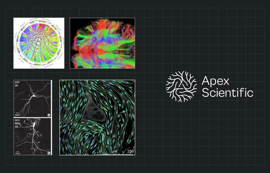
The logo concept above was inspired by structures in the brain, particularly how neurons seek and weave connections during proliferation. Besides the logo’s beautiful radial symmetry and a hidden equilateral ‘A’, it bears tribute to the human brain, the organ that gives science meaning in the first place.
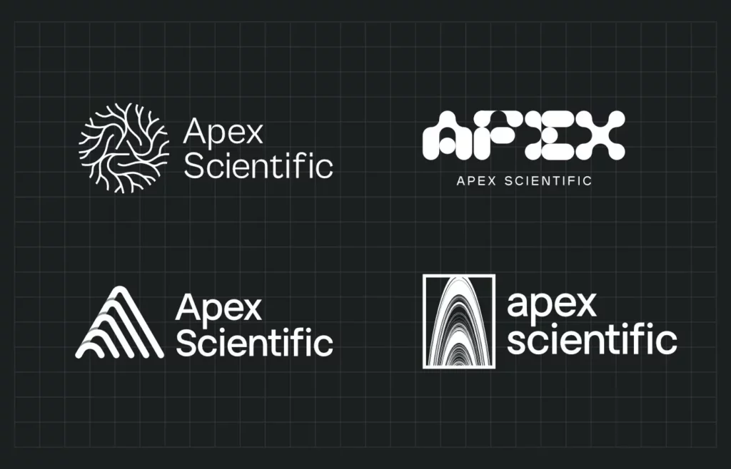
All logo concepts summarised into four final candidates. They ranged in taste and style but were naturally all aimed towards appealing to the client’s sensibility.
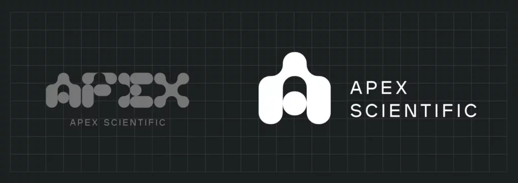
Evolution of the final chosen logo, refining it into a single iconic mark. This ‘A’ mark is strong enough and simple enough to be shrunk down to a laser-etched mark on lab equipment.
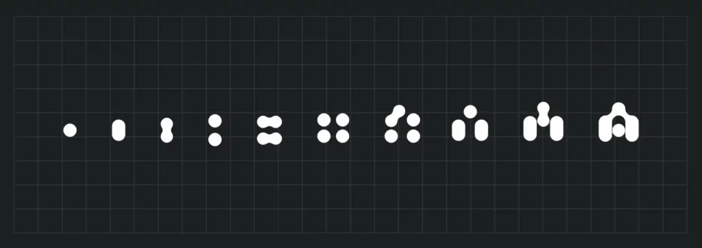
This final logo was inspired by cellular forms, chromosomal structures, and how microscopic liquids behave with a magnified surface tension. The logo animation was inspired by the process of mitosis and is accompanied by a custom in-house jingle and sound signature.
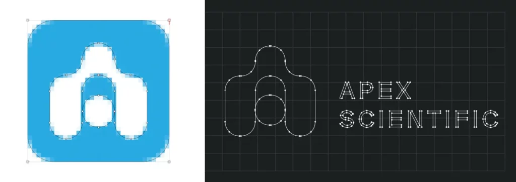
Our work is always delivered in highly standardised and versatile vector formats. We provide all content in highly versatile and lossless vector formats. We also ensure vector artwork translates perfectly to pixel-perfect designs at small sizes, using custom aliasing math to ensure edges look just right.

We create an easy–to–use and comprehensive brand guide for all major brand reworks. This document summarises the complex choices made in terms of colour relationships, typography, shape, image choice, content formats and so on. Without a central source of standardisation like this, all branding choices will quickly be forgotten or become difficult to build upon.

For example, colour must be listed plainly, but also clarified in how it is used. Proportion, contrast and legibility are largely up to the designer to get right, but a brand guide helps set the stage for a strong start.

For the brand, we use simple backgrounds, just two variable typefaces, and a custom shape convention. These shapes are also used to contain images, giving personality and tying content back to the idea of looking under a microscope.

Otherwise stark areas of colour are given similar treatment. We typically prefer to avoid decoration for the sake of it, however, aesthetic minimalism can be an equally distasteful maxim. We enjoy helping clients find the right balance of ‘just enough’ for each content piece.
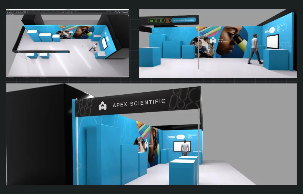
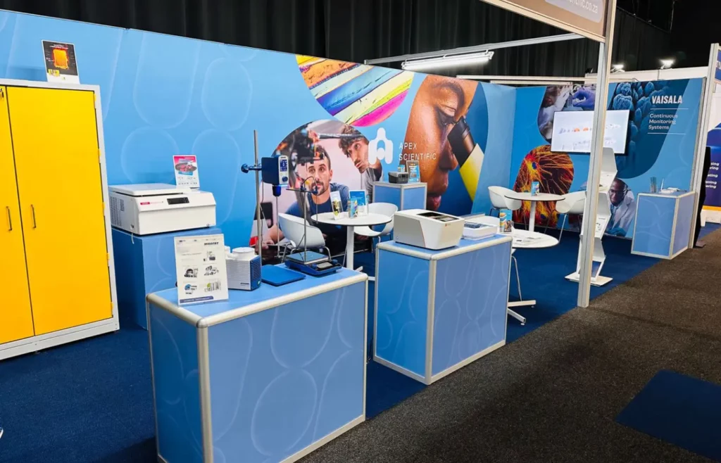
For event stall artwork client needed to quickly visualise, we created a rough 3D mockup to get a sense of scale. This allowed us to quickly refine exactly what the space and client needed, instilling confidence in the production and removing frustration when it comes to print and layout.
The Results
We took an extremely detailed, thorough approach to designing the new Apex Scientific logo and refreshing the brand’s visual identity. The end results were well-thought-out, unique, flexible creative assets that draw attention, intrigue the eye and start conversations. The client was extremely satisfied with the outcomes from this project. We have set strong visual foundations for the Apex Scientific brand and are excited to see how it can grow into the future.
About Apex Scientific
Apex Scientific is a trusted supplier of laboratory equipment across South Africa. They pride themselves on delivering innovative, technologically advanced, durable laboratory equipment to meet the diverse needs of their clients.
